
Today is the final color week presentation.
I had the pleasure of meeting Erin Olson, author of the popular design blog House of Turquoise.
The blog is an outlet where she shares her passion for the color turquoise and beautiful interiors.
Erin expanded on her love of color when she created Decor By Color, a network of 11 blogs that link consumers with places to purchase home decor and other products, sorted mostly by hue. What started as a hobby in 2003 became an obsession which turned into a full-time dream job.
A reception featuring goodies and drinks - all in turquoise - followed her presentation. Cupcake made by Hallmarker Laura!
YUM!!!
Showing posts with label color week. Show all posts
Showing posts with label color week. Show all posts
Thursday, June 17, 2010
it's color week at Hallmark


Wednesday, June 16, 2010
it's color week at Hallmark
Today's presenter was paper artist, Matthew Sporzynski.
Matthew Sporzynski got his start with Estee Lauder creating intricate paper and cardboard versions of luxury accessories. He is most well known for his paper constructions that appear in every issue of Real Simple magazine. 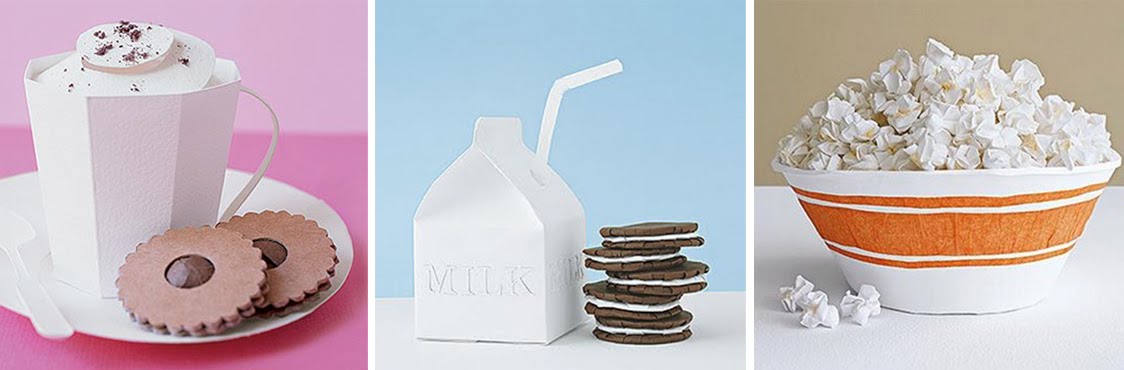
It was really cool to hear him talk about millionaires contacting him to design their personal Valentine's and party invitations.
Tuesday, June 15, 2010
it's color week at Hallmark
A cool thing about working at Hallmark is that we get cool people to come and speak.
This week at Hallmark it's color week. There are presentations on the 2011 color forecast and the week is filled with colorful speakers.
Today it was fine artist, Tim Biskup, long recognized for his complex color and design theories.
It was neat to learn about his struggles of how he became an artist.
Speaking of artist are you watching Work of Art on BRAVO? It's an awesome reality show about artists that premiered last Wednesday.
Kansas City's own Peregrine Honig, owner of local lingerie store Birdies and co-producer of last week's West 18th Street fashion show, is a contestant. She does wonderful illustrative work. And she hasen't gotten kicked off yet!
More about Peregrine here from INK magazine.
Tuesday, March 3, 2009
Peggy Noland • KC Fashion Designer Spotlight
 Peggy Noland • Kansas City
I love Peggy Noland's vibrant work! she's actually the daughter of hallmarkers, and had a fashion show here during our Color Week in August. Jeanne posted about it. She has dressed and collaborated with a few of my favorite bands and musicians, like: CSS, The SSION (who are local to KC as well), Cazwell, and Tilly and the Wall
I got a chance to see the new look of her store, located in the crossroads arts district, not too far away from where we work.
Her tiny shop evolves and changes with her current line of clothes, it's much closer to an art installation. Last spring she said the inside was painted to look like a cheeseburger, then in the summer it turned into a fluffy cloud. Now it's covered in plush teddy bears, rabbits, purple Barney's, Telletubbies, Bubbahs and other children's toys to resemble the inside of vending machine.

The Kansas City Star featured her in this Sunday's Arts & Entertainment section. Check this girl out!
Thursday, August 28, 2008
COLOR WEEK 2008
The final Color Week presentation was by Kansas City’s own Peggy Noland.
The 26-year-old is internationally recognized for her work in clothing design. She just returned, last night, from MAGIC, the world's largest clothing conference in Las Vegas.
Peggy is known for bold designs that walk the line of fashion and art. She introduced her new line through a fun and whimsical fashion show. The theme was baby and the models had lavender and white cotton candy hair. Here are the models and hair/make-up stylists. 
She has a little 35 foot shop on the corner of 18th and Wyandotte (124 West 18TH Street Kansas City, MO ). Peggy said she liked the small space to be able to inexpensively change the store environment to coordinate with her line every four to six months.
Peggy showed some videos during her presentation. One of them is a tongue and cheek music video. She did the women’s clothing.
Peggy’s work has been seen in Woman's Wear Daily, Worth Global Style Network, NY Times, Glamour, British Elle, Brazilian Vogue, to name a few. You can also find out more about her on her MySpace page.
After the fashion show there was a reception colorful cupcakes by Laura J. - oh for heaven cakes. Oh for heaven's "cakes" Laura they were so pretty! Laura uses a special food coloring to get her icing nice and bright.
That puts a close to Color Week (sniff, sniff). Now back to work!
Wednesday, August 27, 2008
COLOR WEEK 2008

Today, Sean Adams, partner of AdamsMorioka and the national president of AIGA came to Hallmark to do a presentation on "There Is No Such Thing As Too Bright."
Sean follows these three principals:
1. THERE IS NO SUCH THING AS TOO BRIGHT
"Fluorescents are the heroin of the color world," he said. At AdamsMorioka they run lots of fluorescent magenta and yellow on the print process to get bright and intense color.
2. THE DESIGN OF REASSURANCE
Colors are cheerful or could trick the audience into viewing something that could be controversial. Sean says, "it's better to seduce than to repulse."
3. COLOR AS A BRAND
An example is that Tiffany's has made their brand with a shade of blue that everyone refers to as Tiffany blue.
In addition Sean says, "it's okay to like what you like." That is what makes you unique. You don't have to like the hottest trend that is out there. What you like may bring something different or a new view to the table.
And... "don't be timid." Use color!
Sean is also the co-author of Logo Design Workbook, Color Design Workbook and Masters of Design.
Tuesday, August 26, 2008
COLOR WEEK 2008

Today, Andy Cruz, owner and art director of House Industries did a presentation on how to bring your hobbies to work.
Andy Cruz has always tried to bring his hobbies to work with him be it hot rods or modern architecture... personal interests have always supplied bottomless inspiration for numerous House projects. 
After graduating from a vo-tech high school with "shop certification" in commercial art, Andy opted to pass on art school and went straight to work at a local design studio. After meeting Rich Roat, the two decided to take a vow of poverty and start House Industries in 1993. The two quickly learned that they needed to cook up a design product instead of a design service... and that product became House fonts.
House type fonts and design work is known the world over for maintaining a healthy obsession with authenticity and stubbornly sticking to traditional commercial art techniques. 
Monday, August 25, 2008
COLOR WEEK 2008
Hallmark's very own trends officianto Scott Butterfield kicked off COLOR WEEK with his 2010 Color Forcast.
2010 is one of the vibrant color forcasts.
Reds include colors like redrum, merry gold and sweetness.
Blues include soap bubble and blue slate.
Greens include turf.
My favorite is a purple color called juicebox (hey, can that possibly be the new Hallmark purple?).
And yellows include olympic and lemony lickit.
Blue is the new green, chocolate brown is now carmel, and silver is pewter and brassy gold.
Handwork is the trend and anything with a glossy/wet look adds to the power of these colors.
Friday, August 15, 2008
TrendPlant ACTIVITIES
Every year at Hallmark the Trends department has COLOR WEEK. It's a week full of inspirational presentations on color.
There is always a cool poster announcing the event. This year the members of TrendPlant were asked to make a poster and ALL of them would be posted. I was so happy and honored to be a part of this project and see my poster along with the other awesome designers in the group.
So here they are!
by Elizabeth
by Court
by Ralanna
by me, Jeanee
by Kristine
by Kim

by Dee
Subscribe to:
Posts (Atom)

